How to Create a Color Palette for Your Brand
NOTE: Creating a color palette is part of creating a full brand identity. To learn more about that, check out my podcast called “How to Create a Brand Identity.” If you prefer reading over listening, you can download the transcript.
When you imagine a website or logo, one of the first things that comes to mind is probably color. Coca Cola red. Starbucks green. Dunkin’ pink and orange.


What do these logos make you think? More importantly, how do these logos make you feel?
Coke’s red stimulates the appetite. It sparks feelings of excitement and passion. Starbuck’s green makes you feel calm and sophisticated. Dunkin’s pink and orange elicit feelings of playfulness and whimsy.
What if these logos weren’t in color?


The effect just isn’t the same. We’ve lost the meaning of the colors. Coke can still get across excitement through its curvy line. But there’s no appetite or passion. How does the lack of color allow Starbucks to make you feel calm? Dunkin’s Frankfurter font is playful, but not as much as their colors.
These logos need color.
Color triggers emotions. And brands are most often remembered based on emotions. In tests of black/white images vs color images, it was shown that black/white images hold people’s interest for less than two-thirds of a second compared to a color image holding attention for two seconds or more (Colorcom — link in notes).
Here are some more interesting statistics from ColorCom about the importance of color.

Color increases brand recognition up to 80 percent
When purchasing a product, 92.6 percent of consumers say that they put the highest importance on visual aspects of the product
Color helps us process and remember images and scenes better
Color improves readership by 40 percent, learning from 55 to 78 percent, and comprehension by 73 percent (think of these statistics when writing a blog post!)
Color is so important in branding that 94 percent of the world’s population recognizes Coke’s red and white logo (Strategic Factory — link in notes). In fact, this is what is responsible for the Pepsi Paradox. While Pepsi wins the “Coke Challenge” for taste, once people know that they are drinking Coke, they end up choosing Coke over Pepsi.
In addition to what you can glean from these stats, how does color benefit your brand?
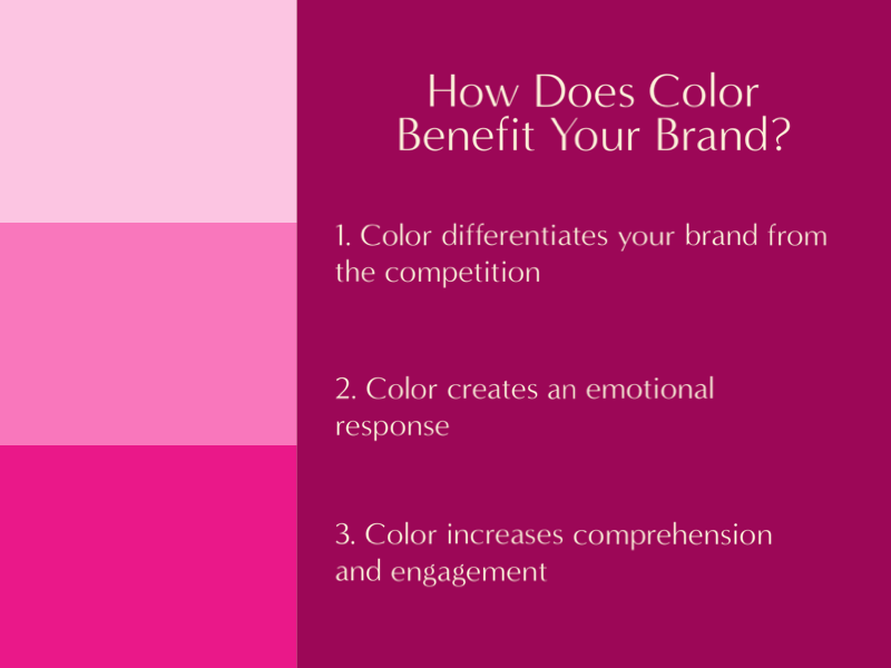
1. Color differentiates your brand from the competition
When you research your competition (one of the steps in creating your color palette), you’ll want to pick a base color that is distinct from your top competitors. If everyone else is using neutrals, you may want to pick something bolder—if appropriate for your industry.
I see so many website designers use neutrals for their websites. So, I went with black and a bolder blue that I matched from the gorgeous sofa in my photo on the homepage of my website. There is a website-design educator whom I admire who uses a bright yellow for her website. It’s gorgeous and really differentiates her from other website-design educators I’ve seen.
2. Color creates an emotional response
The main point of using color in logos and on websites is to elicit an emotional response in customers/clients. People remember us less for what we do and say and more for how we make them feel. Color is a big part of this. For example, before a visitor reads a single word on your website, they’re going to see the colors on your website. Those colors are going to trigger an immediate emotional response. Then they will see the images and start to read the words.
3. Color increases comprehension and engagement
As I wrote in the statistics above, color can increase comprehension, as well as readership and learning. When these things increase, you increase engagement—on your website and with your brand in general. When people get a positive feeling from your colors, they are more prone to stay on your website longer and to buy from you.
Think about your own experiences with color. How often do you pick one product over another based on color? How often do you leave a website because the colors don’t jibe with you or they give you the wrong feeling?
This happens to me all the time. Even if it’s a color that’s not particularly “me,” if the color works and elicits the right feeling, I’ll buy the product or stay on the website. It just has to work. It doesn’t have to be a “me” color. So, when you create your color palette, you will be taking into consideration your industry and your audience. But you don’t have to pick popular, “unoffensive” colors. As long as your colors elicit the right feelings, you’re hitting the mark.
5 Steps to Create Your Color Palette
Now that you know why color is so important to branding, here are the five steps to create your color palette.

1 . Know your basic brand identity
I’m doing a podcast on 4 Feb 2022 called “How to Create a Brand Identity.” I won’t go through it all here. You can listen to the podcast at the link or download the transcript. The process for creating a brand identity includes picking colors. Before picking your colors, it’s important to know some essential basics about your brand.
You need to know your brand heart, brand name, brand essence, and brand messaging.
If you haven’t already gone through these four steps, do this before picking your colors. Don’t pick your colors in a vacuum. Otherwise, your colors won’t align with your brand. You may end up with colors that don’t elicit the right feelings for your brand.
Your brand heart includes your vision, mission, values, and goals.
Your brand essence is your brand voice and personality. For example Dunkin’s is playful and whimsical. Starbuck’s is calming and sophisticated.
Your brand messaging is your tagline, value proposition (what makes you different), and messaging pillars (i.e., three selling points).
Go through this process to understand who your brand really is. This is key in picking colors to reflect your brand.
2. Research color meanings
To elicit the emotions you want your customers/clients to feel, you need to understand what different colors mean. There are tons of articles online about the psychology of color. Colors can have contradictory meanings. For example, red can elicit passion as well as fear, alert, warning, and anger. We know that red means stop from stop signs and red lights. Red roses symbolize love and passion. Red can stand for blood or war. And Coke’s red is for appetite and excitement.
Here is a list of some color meanings.
Red: Passion, love, energy, action, excitement, sexuality, desire, confidence. Danger, anger, aggression.

Yellow: Positivity, optimism, happiness, energy, warmth, creativity, intellect. Cowardice, caution, deception.

Dark Blue: Responsibility, communication, loyalty, trust, confidence, reliability, honesty, support, peace. Conservative, passive, predictable.

Light Blue: Calmness, communication, clarity, stability, empathy, growth, balance, compassion. Secrecy, narcissism, boastfulness.

Green: Health, sophistication, relaxation, balance, hope, prosperity, luck, growth. Envy, judgment, inexperience.

Orange: Optimism, enthusiasm, youth, communication, encouragement, creativity, warmth, positivity. Impatience, superficiality.

Pink: Love, femininity, nurturing, comfort, compassion, warmth, intuition, kindness, playfulness. Immature, unconfident, timid.

Purple: Spirituality, royalty, imagination, inspiration, encouragement, wisdom, fantasy, creativity. Immature, emotional, disconnected.

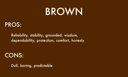
Brown: Reliability, stability, grounded, wisdom, dependability, protection, comfort, honesty. Dull, boring, predictable.
Black: Power, elegance, sophistication, mystery, strength, prestige, authority, security. Dominance, depression, pessimism.

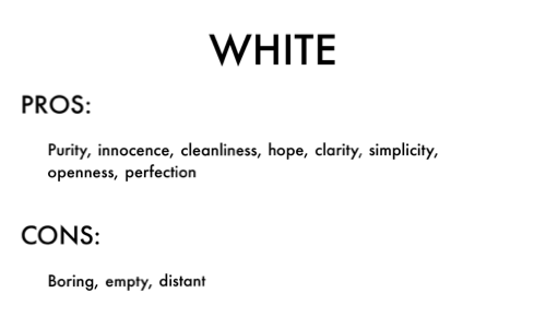
White: Purity, innocence, cleanliness, hope, clarity, simplicity, openness, perfection. Boring, empty, distant.
Grey: Relaxation, neutrality, compromise, soothing, intellect, maturity, reliability, calming. Pessimistic, indecisive, unemotional.

3. Search for inspiration
Now that you understand basic color meanings, dig around online to find logos and websites whose colors you like—and don’t like.
What colors really grab you? What colors repel you?
What websites are really successful at making you feel a certain way? What websites make you want to linger on them longer?
When you find colors you particularly like, take a screen shot, then pull those images into PhotoShop, Adobe Capture (mobile app), Squarespace Site Styles color editor, or Canva to pull out the color codes. That way you can identify the exact colors and use them for your logo and/or on your website.

Adobe Capture — I imported an image of a sunset, and Adobe Capture pulled a color palette out based on colors in the image. On my iPad.
4. Research your customers, your competitors, and the industry
Your favorite color may be pink. But, if you’re a financial services advisor, pink isn’t going to be ideal. First, pink’s meanings don’t really align with your industry. Second, pink will elicit the wrong feelings in your customers/clients. You want them to feel trusting, stable, and secure, not playful and loving. Third, pink is so far outside the industry standard as potentially to be seen as questionable by your customers/clients.
However, there are countless variations of each color you can use. If you are set on a color, and part of its meaning elicits the feelings you’re going for, then you can probably find a variation that will work for you.
As a financial services advisor, you may be able to find a shade of pink/rouge that works as an accent color. Being so far outside the industry standard could help you stand out. Being a feminine color could help you attract more women clients, if that’s your target audience. And pink’s meanings of nurturing, warmth, and comfort do fit into the financial services industry. So, the rules are not hard and fast.
5. Pick your colors

You know your brand. You know the color meanings. You’ve looked for inspiration. And you’ve researched your customers, competition, and industry. It’s finally time to pick your colors!
You’re going to pick four main colors: A base color, an accent color, a variation of white, and a variation of black. You can also have a third main color that a neutral.
The base color will be used most prominently on your website. You’ll use it for buttons and some sections. You might choose to use it for the main navigation bar. You’ll use it for some text on your website. You might use the base color for all or part of your logo.
The accent color needs to coordinate with the base color. It can be a monochromatic color, analogous, complementary, triadic, or a square. You can find all of these variations in Adobe Color CC, Canva, or even Squarespace’s color editor in Site Styles.
If you have a neutral, it can be something like white, gray, or a whitish/grayish version of your base color. If you go that route, pick one from the monochromatic options.
Your white and black, don’t have to be pure white or pure black. Use one of the color wheels to choose something softer, if you prefer. These may go better with your main brand colors.
In addition to Photoshop, I love Adobe Capture and Adobe Color CC for getting really precise with colors. After using Photoshop or Adobe Capture to pull a specific color out of an image, you can use the color wheel in Adobe Color CC (or Canva, Squarespace, or even Google Color Picker) to play with variations of that color. Maybe the color you pulled out doesn’t look exactly as you hoped it would when you see it isolated on the screen. So, use the color wheel slider to see variations of it.

Adobe Color — color wheel, analogous colors
And the monochromatic and analogous color variations are fabulous for this, as they show you similar colors within the same family.

Adobe Color — color wheel, monochromatic
For the accent color, you don’t have to stick with a complementary color or a triadic or square color. I chose a completely different color. But it still coordinates with my dark blue color. You can test this in Adobe Color CC, particularly in the section that allows you to test fonts of different colors on your background color—under Accessibility Tools.

Adobe Color — accessibility tool
Where to Use Your Colors
Repeating your brand colors is going to strengthen awareness of your brand. So, you’re going to want to use your colors everywhere. That doesn’t necessarily mean that every page of your website has to be full-page color. Though it can be!
Logo
Website
Emails
Social media
Advertising
Business cards
I’ve seen really effective branding on websites where the logo is in the base color and all blog-post images use the base colors. That way, when the images show up in the summary on the homepage, they all represent the brand. Same thing on social media. On Instagram, for example, you could have all of your images use your brand colors. This allows for lots of repetition and consistency, and it highly aligns your colors with your brand.
Some other websites, like mine, use the base color on the website but keep the logo black or gray. This allows images on the website and on social media to stand out. I use my “base” color of dark blue in some sections and for buttons. While Squarespace treats my dark blue as a base color, in my eyes it’s really an accent color, as I treat black as my base color. I prefer the meanings of black: Elegance, sophistication, prestige, and authority. But I like the highlight meanings of dark blue: Communication, loyalty, trust, and reliability. Those combine nicely for my work as a website designer.

Adobe Color — color wheel, custom
After you’ve created your color palette, you’ll want to create a brand style guide as a document that holds the information and directs how your styles are to be used. The brand style guide will include other pieces, such as brand overview, tone of voice, logo treatment, typography, image styles, and design styles. I’ll have a blog post about this on 8 Feb 2022.
Creating a color palette is one of the most fun parts of branding. Just remember to take the time to go into it with the essential parts of your brand identity; research on your customers, competition, and industry; and color meanings. Don’t pick your colors in a vacuum. Color is so powerful psychologically. It has a huge effect on the make-it-or-break-it effect of your brand.
By the way, if your website is in Squarespace, check out my video on “How to Change the Color Palette in Squarespace 7.1.” If you already had a color palette set up and need to change it, especially if you want it make it really precise using the hex codes or RGB codes you got in Adobe Color CC, Canva, or Google Color Picker, this video will walk you through how to do it. It’s also a nice guide for uploading an image for Squarespace to pull out a color palette, just like Adobe Capture does. So many options!
Links mentioned in article:
Footnotes:
“The Psychology of Color: How Coca-Cola Captured Hearts Around the World” — Strategic Factory, 23 Nov 2016
“Why Color Matters” — ColorCom